Basic shapes with shape-outside
CSS Shapes can be defined using the {{cssxref("<basic-shape>")}} type. In this guide, we discuss creating rectangles, circles, ellipses, and polygons with the {{cssxref("shape-outside")}} property. These are features defined in the CSS shapes module.
Before looking at shapes, it is worth understanding two pieces of information that go together to make these shapes possible:
- The
<basic-shape>type - The reference box
The <basic-shape> type
The <basic-shape> type is used as the value for all of our basic shapes. This type is a functional notation: the function parentheses contain arguments used to describe the shape.
The accepted arguments vary depending on the shape you are creating. We will cover these in the examples below.
The reference box
Understanding the reference box used by CSS shapes is important when using basic shapes, as it defines each shape's coordinate system. You have already met the reference box in the guide on creating shapes from box values, which directly uses the reference box to create the shape.
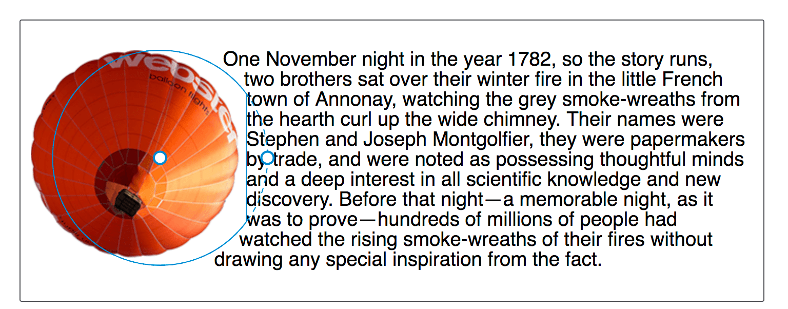
The screenshot below shows the Firefox Shapes Inspector displaying the reference box of a circle created using shape-outside: circle(50%). The element has 20 pixels of padding, border, and margin applied. The Shapes Inspector highlights these reference boxes.

The default reference box for a basic shape is the margin-box. You can see in the screenshot that the shape is defined relative to that part of the Box Model.
While the default reference box is margin-box, this can be modified. To set a different box as the reference box, include the desired box value after your basic shape definition.
These two declarations are the same:
shape-outside: circle(50%);
shape-outside: circle(50%) margin-box;
For your shape to use a different reference box, include a different {{cssxref("box-edge")}} value, for example, to use the border as a reference box for our circle, set:
.shape {
  shape-outside: circle(50%) border-box;
}
Shapes created that extend past the margin box will have the shape clipped to the margin box. The following basic shapes demonstrate this.
For a more extensive explanation of reference boxes as they apply to CSS Shapes, see Understanding reference boxes for CSS shapes.
inset()
The inset() function defines a rectangle. This may not seem very useful as floating an item, without shapes, will give you a rectangular shape around it. However, the inset() type enables the definition of offsets, thus pulling the wrapping text around the reduced-size rectangle, over parts of the floated element.
The inset() function takes up to four side offset values, plus an optional round keyword, followed by a {{cssxref("border-radius")}} value. The below CSS creates a rectangular shape inset from the reference box of the floated element 20 pixels from the top and bottom and 10 pixels from the left and right, with a border-radius value of 10 pixels.
.shape {
  float: left;
  shape-outside: inset(20px 10px 20px 10px round 10px);
}
The offset values use the same rules as the {{cssxref("margin")}} shorthand. Four space-separated values define the top, right, bottom, and left offsets — in that order. You can also set more than one offset at once:
- If there is only one value, it applies to all sides.
- If there are two values, the top and bottom offsets are set to the first value and the right and left offsets are set to the second.
- If there are three values, the top is set to the first value, the left and right are set to the second, and the bottom is set to the third.
The above rules can therefore also be written as:
.shape {
  float: left;
  shape-outside: inset(20px 10px round 10px);
}
In the example below we have an inset() shape used to pull content over the floated element. Change the offset values to see how the shape changes.
{{EmbedGHLiveSample("css-examples/shapes/basic-shape/inset.html", '100%', 800)}}
You can also add a box value as an alternative reference box. In the example below, try changing the reference box from margin-box to border-box, padding-box, or content-box to see how the reference box used as the starting point changes before offsets are calculated.
{{EmbedGHLiveSample("css-examples/shapes/basic-shape/inset-box.html", '100%', 800)}}
You can also create rectangles based on distances from the top and left edges of the reference box with the rect() function, or by width and height with the xywh() function; both of these also support optional rounded corners.
circle()
The circle() value for shape-outside can accept two possible arguments: a <shape-radius> defining the size and the <position> defining its location.
The circle() and ellipse() shape-outside values both accept <shape-radius> as an argument. This can be a {{cssxref("length")}}, a {{cssxref("percentage")}}, or one of the keywords closest-side or farthest-side.
The closest-side keyword value uses the length from the center of the shape to the closest side of the reference box to create the radius length. The farthest-side keyword value uses the length from the center of the shape to the farthest side of the reference box.
The second argument is a position, which accepts a one- or two-keyword <position> value, to indicate the position of the center of the circle. This is specified the same way as {{cssxref("background-position")}}; if one or both values are omitted, the values default to center.
To create a circle, we include a single radius value, optionally followed by the keyword at followed by a position value. This example has a circle applied to an {{htmlelement("img")}} with a width and height of 210px and a margin of 20px. This gives a total width for the reference box of 250px. The 50% value for the <shape-radius> means the radius is 125px. The position value is set to 30%, which is 30% from the left and at the default vertical center.
{{EmbedGHLiveSample("css-examples/shapes/basic-shape/circle.html", '100%', 800)}}
Play with increasing or decreasing the size of the circle by changing the size of the radius, moving the circle around with the position value, or setting a reference box as we did for inset().
The below example combines generated content with a circle() function that uses the keywords top left for position. This creates a quarter circle shape in the top left corner of the page for text to flow around.
{{EmbedGHLiveSample("css-examples/shapes/basic-shape/circle-generated.html", '100%', 700)}}
The shape will be clipped by the margin box
As noted in reference boxes above, the margin-box will clip the shape. You can see this by moving the center of our circle towards the content by setting the position to 60%. The center of the circle will be nearer to the content and the circle will extend past the margin-box. This means that the extension becomes clipped and squared off.
img {
  float: left;
  shape-outside: circle(50% at 60%);
}

ellipse()
An ellipse is a squashed circle. As such, the ellipse() function acts in a very similar way to circle() except that we have to specify two radii, x and y, in that order.
These may then be followed by one or two <position> values, as with circle(), to define the location of the center of the ellipse. In the example below, we have an ellipse with an x radius of 40%, a y radius of 50% and the <position> set to left. This means that the center of the ellipse is at the center of the left edge of the reference box. This creates a half ellipse shape around which the text will wrap. You can change these values to see how the ellipse changes.
{{EmbedGHLiveSample("css-examples/shapes/basic-shape/ellipse.html", '100%', 800)}}
The keyword values of closest-side and farthest-side are useful in creating a quick ellipse based on the size of the floated element reference box.
{{EmbedGHLiveSample("css-examples/shapes/basic-shape/ellipse-keywords.html", '100%', 800)}}
polygon()
The polygon() function is more complex, enabling the creation of multiple-sided polygon shapes. This shape accepts three or more pairs of values (a polygon must at least draw a triangle). Each space-separated pair of values is separated with a comma and represents the coordinates of a single vertex drawn relative to the reference box. Each pair of coordinates defines an edge of the polygon, with the final edge defined by the first and last set of coordinates.
The example below creates a shape for text to follow using the polygon() function. Try changing the coordinate values to see how the shape changes.
{{EmbedGHLiveSample("css-examples/shapes/basic-shape/polygon.html", '100%', 800)}}
To create even more complex shapes, you can define the outline of any shape with the path() or shape() functions.
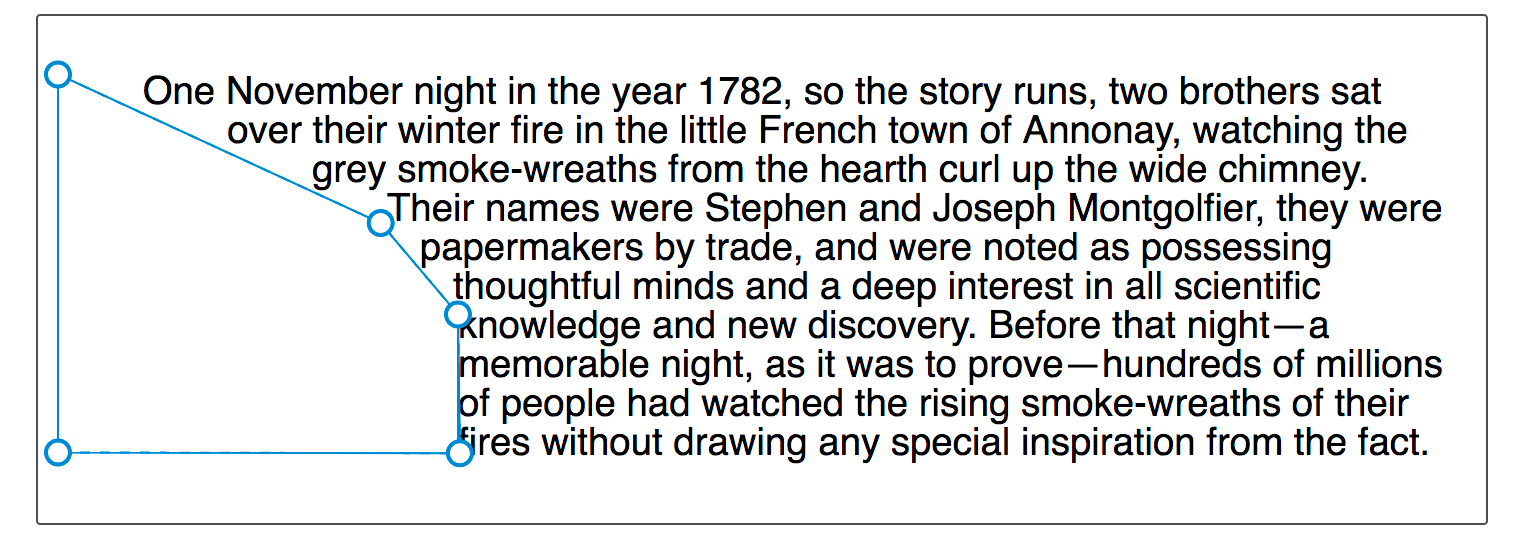
The inset(), circle(), ellipse(), and polygon() are inspectable and editable using the Firefox Developer Tools Shape Inspector. The screenshot below shows the shape highlighted in the tool.

Another resource is Clippy, a tool for creating shapes with examples using the CSS {{cssxref("clip-path")}} property, which uses the same basic shape functions and values as the shape-outside property.